Last month, while checking the photos from the Tour of California, I noticed the continuation of a bad trend. Namely the bastardization of the US Road Champions jersey, one of the most distinctive, and finer national champions jerseys out there.
Sure, the Belgian tricolor is pretty cool, as is the Italian, but apart from different hues of the same color the Dutch, and the Luxembourg champions jerseys are almost the same. If you're not paying attention, you might confuse both for being the the French jersey, except the French, being the contrarians that they are, flipped the red and blue. Then you've got a bunch of white jerseys with colored stripes on white, like the German, British, and Australian. Boring.
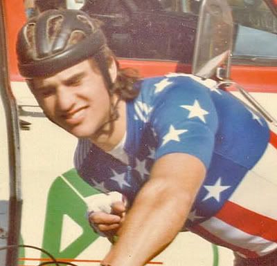
I'm all for innovation, and would hardly call myself someone who's overly nostalgic for the good old days. I just wonder why someone would tinker with a jersey as simple as the ol' Captain America stars and stripes?
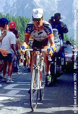
Maybe the whole rethinking of the stars and stipes can be blamed on Banesto, who weren't happy that their star rider - Miguel Indurain - won the Spanish Championship, the week before the Tour de France. Wearing the tricolor would apparently have diminished the impact of the Banesto look (or maybe this was all smoke and mirrors to cover upo the fact that Indurain, the Basque, didn't want to wear Spanish colors?). Their solution? Instead of a trilcolor jersey, wide red and yellow bars were added to the sleeves.
OK, enough talk, let's just look at the jersey, and how its design has progressed over the years.
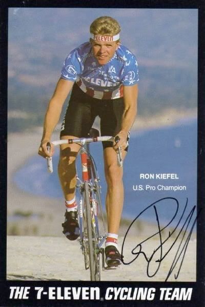
In 1988, Ron "The Wookie" Kiefel, debuted the stars and stipes at the Tour De France. Note the introduction of sponsors name and logos, otherwise, it's clean and simple.
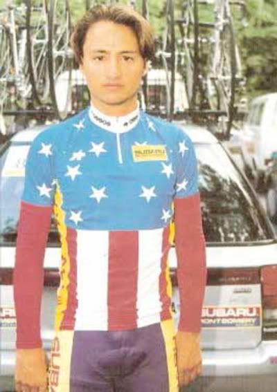
In 1992 Bart Bowen's jersey design includes yellow side panels to give the sponsor some added notice. To make up for that, they left the field of blue virtually untouched.
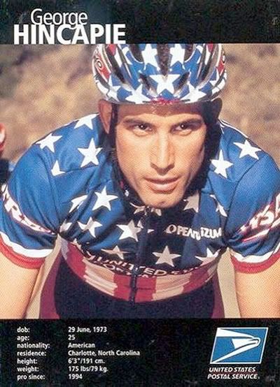
After several years absence, George Hincapie brought the stars and stripes back to to Tour de France in 1998. Other than adding a stars and stripes helmet, the ensemble retained it's classic look.
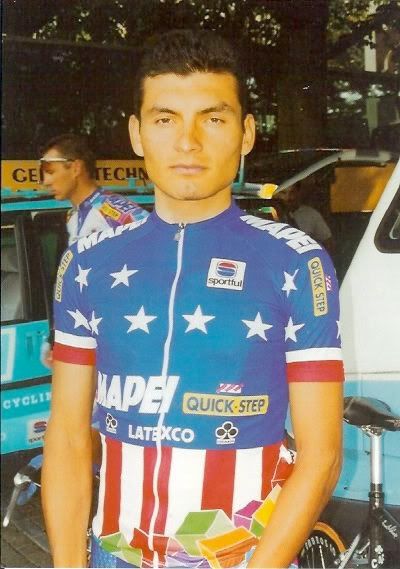
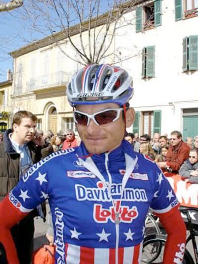
Fred Rodriguez won the first of his three US Pro Road Championships in 2000. Apparently the designers at Sportful didn't get the memo that "if it ain't broke, don't fix it." They decided to add some of those Mapie blocks to the bottom of the jersey. While one could say it was playful - it was - others might say it was unnecessary. I never liked the Mapie jerseys, so I think you might know where I stand.

Chann MacRae brought back the simple stars and stripes in 2002, and for that we were glad.
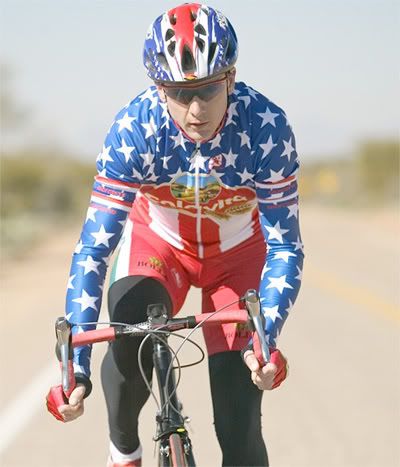
In 2003 the designer of Mark McCormack's kit got a little carried away with his/her stars. I suppose they were overcompensating for the enormous logo they slapped on the chest.
After a brief hiatus from top European racing, Fast Freddy brought the stars and stripes jersey back to the big show in 2004. This time the designers kept it simple.

In 2005 Chris Wherry sported the national champions jersey. This may have been the last year that the stars and stripes were - more or less - left intact. Then again, Wherry's team, Toyota United, wore kit that could have been confused for US Champion kit. Toyota weren't bad, but they weren't that good.

2006 is the year when things started to go drastically wrong when George Hincapie won his second national championships. Someone at Nike, or Trek, or whomever designed their kit, clearly was let off the leash. The result? Subliminal stars; red stripes on the shoulders; the LiveStrong inspired design flourish of the singular yellow band on the arm; and a big blue marble slapped on top. What a mess.
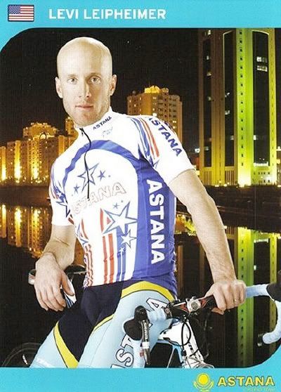
Now, just when you thought it couldn't get anyway worse than Big George's jersey, it does. What in god's name was the designer responsible for Levi Leipheimer's 2007 champions jersey thinking? Where's the stars, where's the stripes? All I see are some vertical stripes, with a few stylized stars. I can only imagine what little Levi thought when he first saw the kit.
Seeing as he races for a team that does everything their own way, it shouldn't have come as a surprise that Tyler Hamilton's US Champions jersey would continue the trend of being different than years past. Thing is, who would have ever expected that on his debut as the US Champion, Hamilton's stars and stripes would be replaced by the bars of a Union Jack at last years Tour of Britain? Not me.
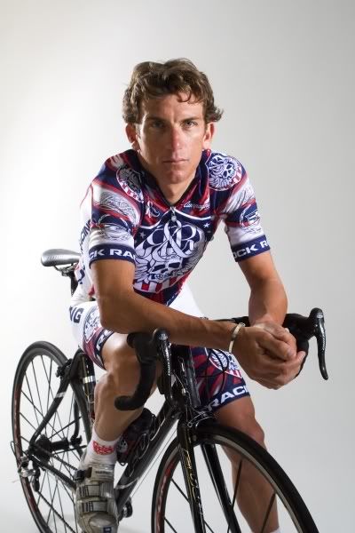
Maybe Michael Ball realized the error of his ways, because the next appearance that Hamilton made wearing the jersey was in this photo shoot, for an October 2008 issue of VeloNews. If you look, you can see that there's some stars and stripes in there. Not tons, but hey, they tried.
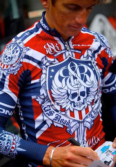
At this years Tour of California, Hamilton's national champions status got all stealthy. Who would have ever imagined that designers at Rock and Republic were capable of subtlety? Not me. But that's precisely what they were.
If you look hard, you can see that Hamilton had some red and white stripes inside the Rock Racing logo. He's also sporting stars and stripes on his arms, which is strange, seeing as that's normally reserved for former champions.
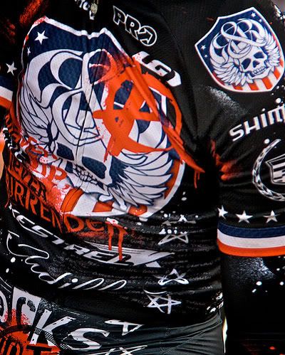
Now, the last images I saw of Tyler Hamilton came from the Vuelta Mexico Telmex. Either Rock Racing were sent a stern letter from USA Cycling, or they like to redesign the national champions kit almost as much as they redesign their own. The latest incarnation of Hamilton's kit almost brings us back to the classic stars and stripes.
Sure, there's an Anarchy A in there, and some sublimated stencil aesthetics, but hey... it almsot looks a national champions jersey that even Eric Heiden might wear. Or not?

By the time that Big George made it a hattrick of championships, he must have known what he wanted, and what he didn't. I'm sure it also helped being an investor in the company that made his kit.
This time the kit has (more or less) gone back to basics. Stars. Stripes. White Shorts? Well, two out of three isn't bad.

After the slow creep back to the classic look, it should come as no surprise that the people responsible for Big George's second jersey and Levi's mystery champion jersey would return with another stealth champions jersey.
Poor Ben King. Comes out of nowhere to become US Champion, and no one gets the chance to notice.
Fred Rodriguez won the first of his three US Pro Road Championships in 2000. Apparently the designers at Sportful didn't get the memo that "if it ain't broke, don't fix it." They decided to add some of those Mapie blocks to the bottom of the jersey. While one could say it was playful - it was - others might say it was unnecessary. I never liked the Mapie jerseys, so I think you might know where I stand.
Chann MacRae brought back the simple stars and stripes in 2002, and for that we were glad.
In 2003 the designer of Mark McCormack's kit got a little carried away with his/her stars. I suppose they were overcompensating for the enormous logo they slapped on the chest.
In 2005 Chris Wherry sported the national champions jersey. This may have been the last year that the stars and stripes were - more or less - left intact. Then again, Wherry's team, Toyota United, wore kit that could have been confused for US Champion kit. Toyota weren't bad, but they weren't that good.
2006 is the year when things started to go drastically wrong when George Hincapie won his second national championships. Someone at Nike, or Trek, or whomever designed their kit, clearly was let off the leash. The result? Subliminal stars; red stripes on the shoulders; the LiveStrong inspired design flourish of the singular yellow band on the arm; and a big blue marble slapped on top. What a mess.
Now, just when you thought it couldn't get anyway worse than Big George's jersey, it does. What in god's name was the designer responsible for Levi Leipheimer's 2007 champions jersey thinking? Where's the stars, where's the stripes? All I see are some vertical stripes, with a few stylized stars. I can only imagine what little Levi thought when he first saw the kit.
Seeing as he races for a team that does everything their own way, it shouldn't have come as a surprise that Tyler Hamilton's US Champions jersey would continue the trend of being different than years past. Thing is, who would have ever expected that on his debut as the US Champion, Hamilton's stars and stripes would be replaced by the bars of a Union Jack at last years Tour of Britain? Not me.
Maybe Michael Ball realized the error of his ways, because the next appearance that Hamilton made wearing the jersey was in this photo shoot, for an October 2008 issue of VeloNews. If you look, you can see that there's some stars and stripes in there. Not tons, but hey, they tried.
At this years Tour of California, Hamilton's national champions status got all stealthy. Who would have ever imagined that designers at Rock and Republic were capable of subtlety? Not me. But that's precisely what they were.
If you look hard, you can see that Hamilton had some red and white stripes inside the Rock Racing logo. He's also sporting stars and stripes on his arms, which is strange, seeing as that's normally reserved for former champions.
Now, the last images I saw of Tyler Hamilton came from the Vuelta Mexico Telmex. Either Rock Racing were sent a stern letter from USA Cycling, or they like to redesign the national champions kit almost as much as they redesign their own. The latest incarnation of Hamilton's kit almost brings us back to the classic stars and stripes.
Sure, there's an Anarchy A in there, and some sublimated stencil aesthetics, but hey... it almsot looks a national champions jersey that even Eric Heiden might wear. Or not?
By the time that Big George made it a hattrick of championships, he must have known what he wanted, and what he didn't. I'm sure it also helped being an investor in the company that made his kit.
This time the kit has (more or less) gone back to basics. Stars. Stripes. White Shorts? Well, two out of three isn't bad.
After the slow creep back to the classic look, it should come as no surprise that the people responsible for Big George's second jersey and Levi's mystery champion jersey would return with another stealth champions jersey.
Poor Ben King. Comes out of nowhere to become US Champion, and no one gets the chance to notice.

5 comments:
No mention of JV's never-enough-argyle obsession incorporating into DZ's latest US TT champ scheme? http://kwc.org/cycling/photos/media/Prologue__Sacramento/500w/Dave%20Zabriskie-2.jpg
time trial jerseys don't count: they haven't been around long enough, and you only see them at TTs.
besides, i like the argyle addition.
Levi I think was said to have helped design his jersey himself.
wow great post. you just taught me a history lesson, thanks!
This is great history/commentary. I actually saw Bart Bowen and very young Freddie among others in the 80's, 90's.Fun.
Post a Comment